I decided to have a little bit of fun with these tools by using information from my historic preservation thesis on gender and Virginia’s equine landscape. While I don’t think StoryMapJS and TimelineJS are the best tools for analyzing and sharing my research, I enjoyed experimenting.
I liked several aspects of StoryMapJS, including its ability to show locations in relation to each other and its integration of media with text and maps. However, I found the tool to be limited in arranging information about a concept as abstract as gender. Since it organizes the locations in a chronology, I think it would work better as a timeline. I ultimately ended up organizing my information about the horse farms in a manner that shows the male-run farms before the female-run ones. Conveniently, this method forms a clean loop on the map. Had I tried to arrange the farms chronologically, the map would have been more confusing, especially if I added more farms. I also don’t like how the map appears on my blog.
I found TimelineJS to be a better tool for creating a history of some of the women in my study’s racing accomplishments. However, I would have had to add considerably more information about men in racing, U.S. history, and gender roles to develop a meaningful context for these seemingly isolated events. I like the aesthetics of TimelineJS because they are clean, straightforward, and the colors, backgrounds, and media can be manipulated more than in StoryMapJS. However, I wish the images used in the timeline could be enlarged.
Ultimately, I don’t think my group will likely use these tool for our 3D laser scanning project for the James Monroe Museum. However, we could possibly use StoryMapJS to map out the origins of the objects we scan to provide visuals. We could also use TimelineJS to create a map of when the objects were made or when they were acquired by James Monroe, although this information could be broad and defeat the purpose of making a timeline.
Although I find Feedly a little bit difficult to navigate, I hope that it will make it easier to keep up with new blog posts by my classmates and members of the DH Compendium.
I think that both WordPress and Omeka could be useful for digital history projects. Although we have not yet learned much about WordPress beyond using it as a blog, it could also be used as a website for a digital history project. WordPress makes it easy to create multiple pages and sub-pages that could be used to make navigating and organizing the project straightforward. The search bar could pull up blog posts or pages featuring specific tags. Additionally, pages could be created that link to media like images, videos, or downloadable documents, although the media could also be embedded in a page with text. While I think WordPress might be a better tool for organizing online history projects that involve large amounts of text, I currently think that Omeka works better for archival or collections-based projects. Since Omeka uses Dublin Core, it standardizes and professionalizes the information about each item. Omeka also allows the users to group items into collections and exhibits for online displays, which seems to give it more flexibility than WordPress.
Of the websites I reviewed, I liked The Emancipation Project the least because it was disorganized, only provided snippets of information, did not provide information about the graphic or source on the same page as the source, and did not contextualize the graphics or sources. I found the graphics interesting and they helped me visualize the subject, but they still did not mean much to me without background information. I also found Valley of the Shadow difficult to navigate and not visually appealing. However, I liked that all of the documents have been transcribed and are searchable, which partially mitigates the difficulties of navigating the site. Exploring the French Revolution was also problematic because it used icons to link to sources instead of a small image of the source. I think this hampers conducting research using the primary documents. I also believe that copies of the sources should be scanned so users can look at an image of the original as well as the transcribed version. However, I thought the essays provided useful information despite being unwieldy because the content is on several pages. I also liked how it is possible to search for a specific term across all of the source types to find documents both containing tags or the specific phrase.
I liked Gilded Age Murder the best because it provided extensive background information about both the subject and historical interpretation, the sources had images helping make it easy to navigate, and it was visually appealing. However, the documents have not been transcribed and they are not searchable. While I also liked the extensive amounts of information, timelines, and bibliographies presented in Imagining the Past, I found it difficult to navigate and sometimes repetitive. I also found the lack of standardization distracting. One example was the website’s use of “works cited,” “bibliography,” “further reading,” and “resources” as page names for the bibliography. I also enjoyed Avery’s Architectural Ephemera Collections because the navigation was straightforward and the content was not overwhelming. The website listed each of the categories of ephemera. The category provided a description of the items in the collection, images of a sampling of items, and a link or description of where all the items in the collection could be searched.
Reviewing these digital history websites has made me realize how difficult it is to create one. I like how Omeka can organize items into a collection and provide the information associated with the object because it is easier to navigate. I also think that it is important to consider font legibility and visual appeal.
I am taking this class because I would like to increase my proficiency with digital tools and learn about the methodology behind digital history projects. I believe that digital history is an important tool for making history more accessible and engaging for a variety of audiences. Additionally, digital history projects can further the preservation and increase the accessibility of historic resources ranging from documents and objects to entire buildings and landscapes. One of my interests is using Autodesk products combined with technologies like 3D laser scanning and infrared photography to document and monitor the deterioration of historic structures, as well as to create interactive catalogs to record the history and treatments for each architectural component.
Being a double major in historic preservation, I like to examine how people use the built environment. Since both the ITCC and the History of the Information Age are new, I wanted to reflect on how our class functioned in our classroom space. I don’t think the format of our class was best suited for the space and vice versa. The classroom was too large for a discussion-based seminar. The spread apart tables frequently made people look inward instead of facing outward into the conversation. I think the discussions would have flowed better if we sat around a large table or pulled our chairs into a circle. However, the space was well-suited for our warm-up activities. The large center space was perfect for playing trainwreck and using the white boards. Similarly, the computers at each table were wonderful for activities requiring us to explore our own technology and information usage. If the History of the Information Age is taught in ITCC 327 again, perhaps the focus should be on group work more than discussion. If so, maybe some of the readings and parts of the syllabus need to be reworked so the groups can digitally explore topics such as early communication during class. Otherwise, maybe the class should consider having one seating arrangement for group work and another for discussions.
I chose to create an infographic representing the geographic digital divide in the United States. When I conducted my preliminary research on the digital divide in the United States, I was struck by how few scholars focused on geography and population density. Understandably, they primarily studied contributing factors such as race/ethnicity, gender, age, income, and education levels. I decided to create an interactive map showing the percentages of households with Internet access per state, although a county-by-county map would have been more accurate. I used a gradient to highlight the geographic trends among the states. States with the smallest percentages of households with internet access are the lightest colors, while those with high percentages are the darkest. Each color represents a 5% increase in households with access. The viewer can see the exact percentage by hovering their cursor over each state.
The maps show that rural households generally have less internet access than urban households. Still, only 50%-75% of urban households have internet access. However, people living in urban areas also have greater access to internet outside of their homes. Primary factors impacting rural internet access include infrastructure and income, while income, race/ethnicity, and education level have a larger impact on urban internet access. The digital divide in America has huge implications. The digital divide makes it difficult for people without internet to access information quickly. The digital divide also impacts these people’s visual and digital literacy, affecting everything from their ability to deconstruct images in a political campaign to their ability to find a job in the 21st century–ultimately helping to reinforce income inequality.
I used Piktochart and a 2007 survey by the National Telecommunications and Information Administration.
Sources:
National Telecommunications and Information Administration. “State by State Internet Usage.” 2007. http://www.internetworldstats.com/am/USA_Internet_Usage_2007.pdf (accessed December 1, 2014).
Real, Brian, John Carlo Bertot, and Paul T. Jaeger. “Rural Public Libraries and Digital Inclusion: Issues and Challenges.” Information Technology & Libraries 33, no. 1 (March 2014): 6-24. OmniFile Full Text Mega (H.W. Wilson), EBSCOhost (accessed December 2, 2014).
Warf, Barney. “Contemporary Digital Divides in the United States.” Tijdschrift Voor Economische En Sociale Geografie (Journal Of Economic & Social Geography) 104, no. 1 (February 2013): 1-17. Academic Search Complete, EBSCOhost (accessed December 2, 2014).
I think our infographics class activity on Tuesday was actually a pretty good representation of the assumptions people make about their audience’s visual literacy and cultural knowledge when they create infographics. For example, Table 3’s infographic expects viewers to understand that they are looking at a timeline, even though it isn’t formatted as a traditional timeline. The infographic also assumes that the audience recognizes Pusheen. Similarly, Table 4’s infographic takes for granted that the user knows to hover over each state to see the number of Olympic medal recipients. It also expects viewers to figure out that it only represents the contiguous states. While these all sound like simple examples, they reveal that the makers of infographics expect at least a basic level of visual literacy. A third grade viewer may have recognized Pusheen, but also not realize that two states are missing from the map of the U.S. I think these infographics highlight the need for designers to consider their audiences, as well as the need for visual literacy education.
The article “The Web Means the End of Forgetting” by Jeffrey Rosen disturbs me. I’m not that bothered by the lack of privacy on social media accounts -don’t share things if you mind the public knowing about it. What really concerns me is the potential for people’s private reputations to be ranked and made available on the internet. Maybe I’m old-school, but I think that you should primarily judge a person’s private reputation by getting to know them. I’m afraid of how subjective these ranking systems would be. So often we misjudge each other first based on a friend’s comments instead of our own interactions. I think taking what is a normal social defense mechanism and applying it broadly to people through the internet could be detrimental to our formation of relationships. I honestly don’t want my social desirability ranked. I’m an intense, introverted person, so I would probably receive poor ratings because it takes a while for people to get to know me -something that my social media profiles do not reflect.
Last week Carla posed several interesting discussion questions about what will happen to art in the Digital Age. She wondered if the quality of art would decrease because people have broader access to programs to create and spread their work. Ultimately, I don’t think the quality of high art will decrease. Throughout the Information Age, people have spent the time and money to develop the skill necessary to become an artist. Frequently this involves studying with masters in the field. I highly doubt this will change during the Digital Age since it is almost impossible to learn how to do art well without the help of a master who must be paid for their time and expertise, even if they teach long distance lessons over Skype.
However, I do believe that the Digital Age has made the creation of art more accessible to the general population. The people who don’t have the time or money to extensively study an art form now have ways to creatively express themselves, inundating the internet with art. Despite the increasing amounts of art, I don’t think our society will be overrun with poor art. Our society has aesthetic standards that help us judge the masterwork from the work of a talented amateur from a hack.
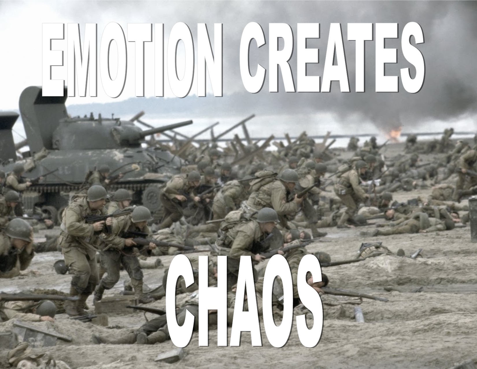
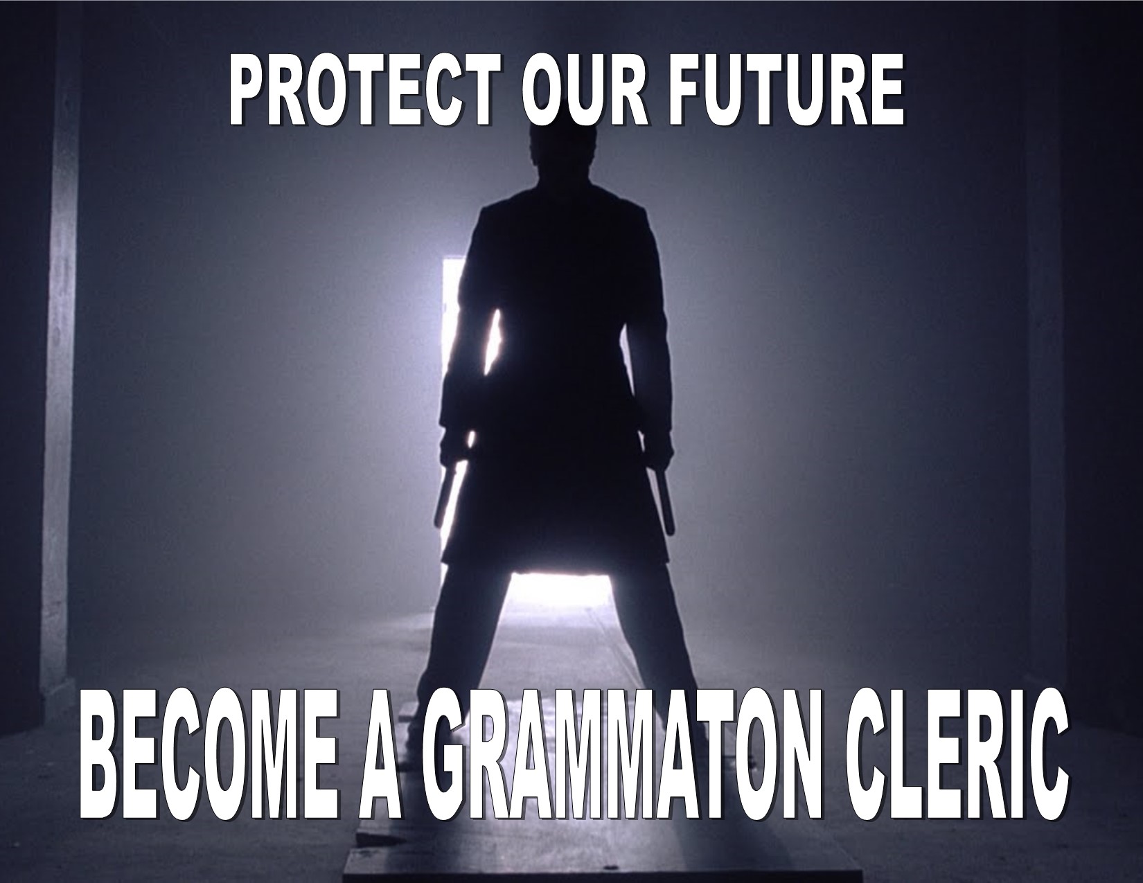
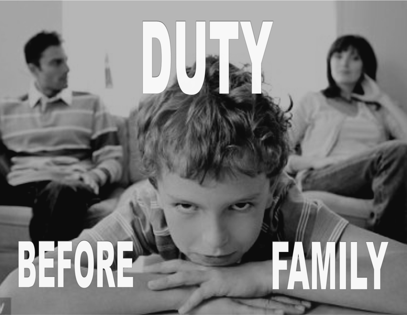
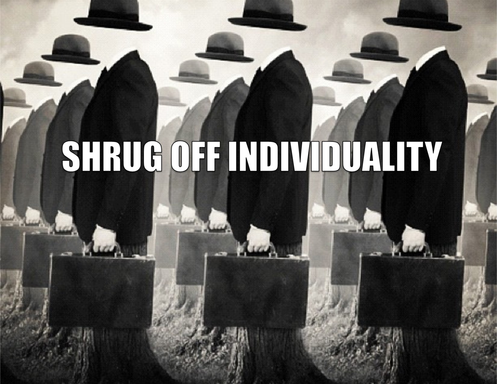
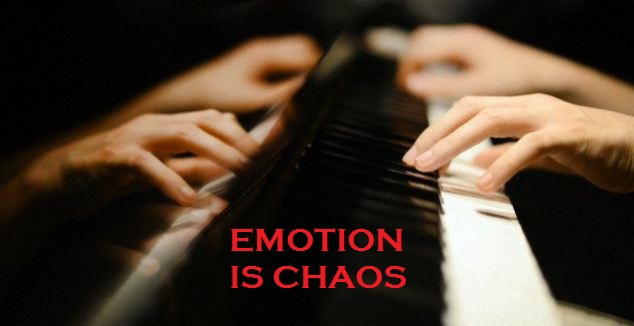
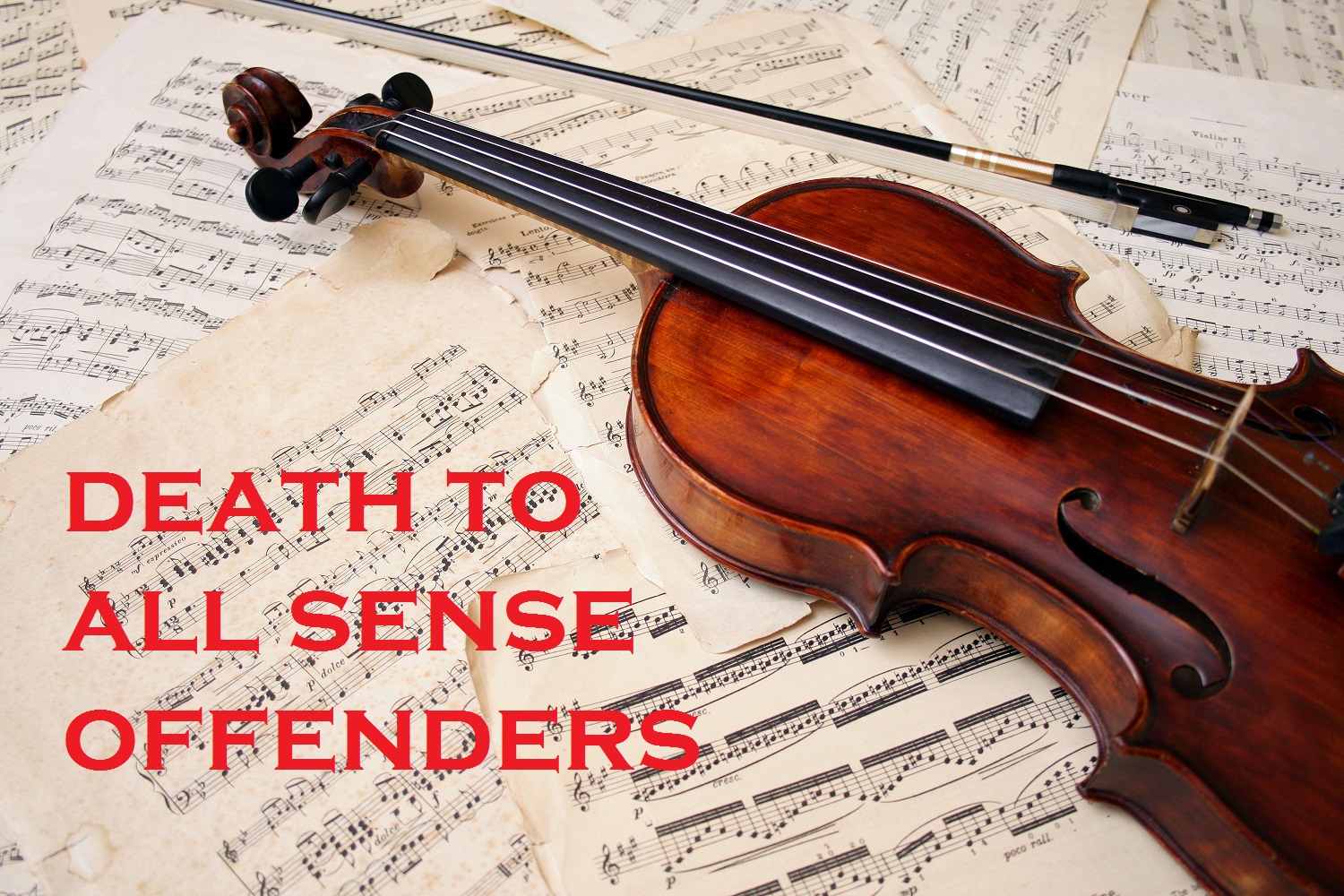
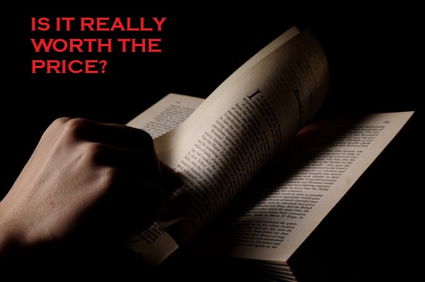
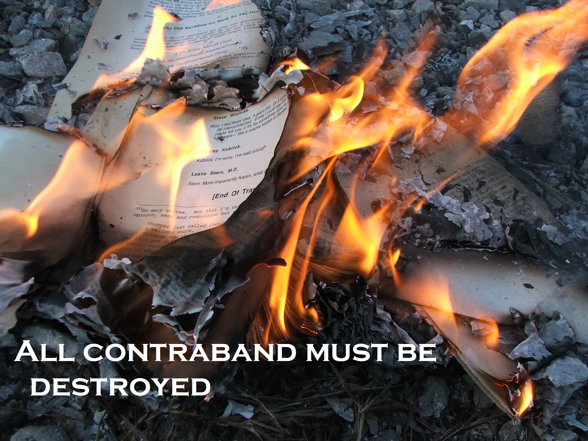
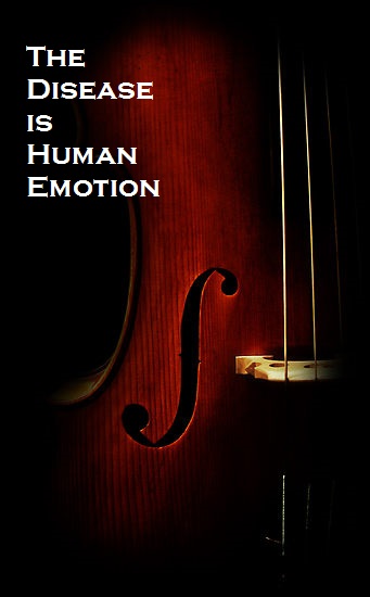
Group six decided make a propaganda campaign for the movie Equilibrium, a dystopian science fiction film. The movie is set in a futuristic society (it takes place in 2072) named Libria, where citizens take a drug called Prozium to suppress their emotions and foster obedience to the totalitarian regime. The regime incinerates contraband items that have the potential to stimulate emotion such as music, art, and literature. Citizens who possess contraband and do not take Prozium are known as Sense Offenders. The law enforcement, called the Grammaton Clerics, destroy contraband and execute Sense Offenders.
Our group chose to create visual forms of propaganda to reflect the complexity of Librian governmental control. Visual propaganda is almost inherently a form of art because it has an aesthetic specific to its creators. Since art is banned in Libria, we faced the challenge of deciding what images were acceptable to be displayed. This ambiguity was compounded by the fact that Libria is set in a digital age where photography could easily be considered a form of art. Because images are so integral to visual propaganda, we decided to primarily use photographs to convey the messages. We chose dark images that fit the artistic style of the movie. These images fit the perspective of the regime: they portray the arts and individuality as dangerous and destructive. The darkness of the images suggests that the denial of emotion coupled with duty and obedience to the regime are the only ways that humans can continue to survive in a world that would otherwise be ripped apart by emotion. Our posters seek to accomplish the goals of the regime by influencing citizen’s perceptions and controlling their behaviors. They use scare tactics to deter citizens from using contraband while flag-waving encourages them to take Prozium and report Sense Offenders.
Likewise, the propaganda video relies on disturbing historical images and darkness to visually convey the dangers of human emotion. We chose to make the film silent since the regime banned music. We also decided against having sound effects or a voiceover, instead allowing the full weight of the words and images to sink into the viewer. The pressure created by darkness and solemnity of the white words on the black background resolves with the appearance of the national flag at the end of the video. The patriotic flag conveys the authority of the government with the assurance that those who submit to the regime and its use of Prozium will survive. The ad nauseum repetition of the video and the posters seeks to make the citizens accept the fact that emotions and emotional stimuli will destroy their society.
We used quotes and screencaps from the movie to make our video.
Movie Citation:
Equilibrium. DVD. Directed by Kurt Wimmer. 2002; New York City, NY :Dimension Films, 2003.
Image Sources:
“Book Burning.” Wikipedia. http://en.wikipedia.org/wiki/Book_burning (accessed October 29, 2014).
C., Radford. “Christian Bale in Equilibrium (Video).” Lazy Tech Guys. http://lazytechguys.com/news/christian-bale-in-equilibrium-video (accessed October 29, 2014).
Cello and Strings. http://www.celloandstrings.com/ (accessed October 29, 2014).
Enck, Denise. “Self-publishing Your Poetry Book or Broadside.” Empty Mirror. http://www.emptymirrorbooks.com/publishing/self-publishing.html (accessed October 29, 2014).
Jain, Anurag. “Life of Conformity in a Free Society.” Neev Forum For Integral Living. http://neevintegralliving.com/archives/756 (accessed October 29, 2014).
“Saving Private Ryan.” Fanpop. http://www.fanpop.com/clubs/saving-private-ryan/images/1669340/title/storming-beach-wallpaper (accessed October 29, 2014).
“Separating parents forced to attend custody classes so they realize damage to children.” Daily Mail, September 25, 2010. http://www.dailymail.co.uk/news/article-1315115/Separating-parents-forced-attend-custody-classes-realise-damage-children.html (accessed October 29, 2014).
Woollaston, Victoria. “Forget brain training: Playing a musical instrument can sharpen your thoughts – and help ward off depression and dementia.” Daily Mail, September 27, 2013. http://www.dailymail.co.uk/health/article-2435013/Forget-brain-training-Playing-musical-instrument-sharpen-thoughts–help-ward-depression-dementia.html (accessed October 29, 2014).
I decided to interview my mom about what she thought of coding webpages for Web 1.0 versus Web 2.0. She was an IT specialist for the government. She said, ” the old fashioned coder had to interview the customer to find out what the requirements were and then use creativity to design the page in their mind or on paper. The coder had to use their technical skills and understanding of html to produce the website. Coding forced you to use your memory, have a tremendous focus on detail to make sure all your tags were there, and an enormous amount of cross-checking to make sure that everything worked. It was costly, time consuming, and laborious, but I really enjoyed the thrill of success when I could find, diagnose, and correct problems. Overall, it was a tremendously creative process. I’m sure having software that does it for you is cheaper, quicker, and obviously more productive. It also probably has better and more interactive features than what I worked on. There are good things, but I can’t help but wonder if present creators of webpages haven’t lost the thrill of succeeding from building from a totally blank, text document to a dynamic webpage. That thrill is the thrill that programmers have, not application users.”
I found my mom’s thoughts an interesting reflection of the Web accessibility that we discussed in class. Her comments reflect the exclusivity of Web 1.0, but they also touch on the more widespread accessibility of Web 2.0. I especially find her comments on the creativity and skill of coders thought provoking because they parallel so many other trends created by improved technology such as people losing their ability to read maps because of GPS devices. Nowadays, people like me can create webpages without knowing how to code. However, as an application user, I can’t even comprehend the technical skill required to visualize the design for a webpage inside of my head. I just don’t have that level of mastery.